
Corporate identity for a company that trades mostly spices & herbs.
Designed in collaboration with Ioannis Katsinis - IKVC.
Designed in collaboration with Ioannis Katsinis - IKVC.
Main aim of design was to create a contemporary identity that has a bond with the past, because heritage and experience are the characteristics that make our client’s company unique
in this specific product sector.
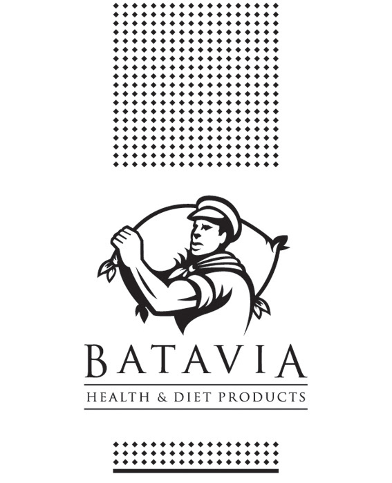
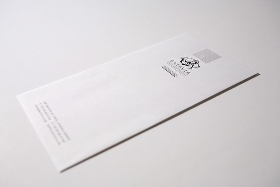
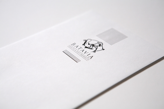
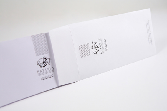
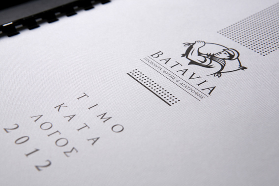
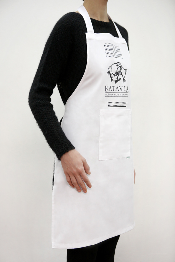
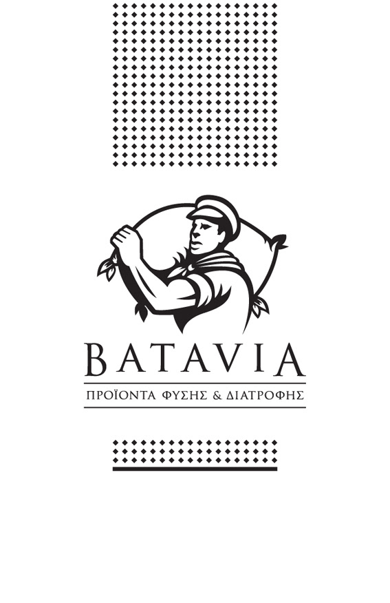
So, Batavia was chosen as the most suitable main name and logo for the company, since it used to be one of the greatest spices and herbs trade centers of the world. At this direction, the working man became the logo sign as it consists of a figure-symbol of the way that ships were loaded with the commodities in the old ports.
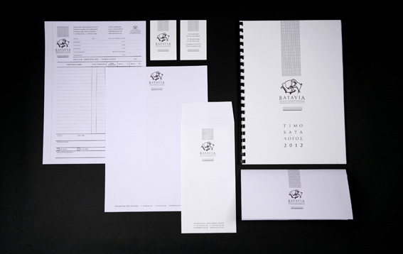
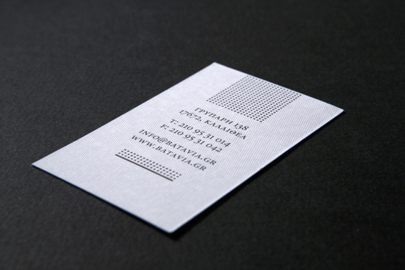
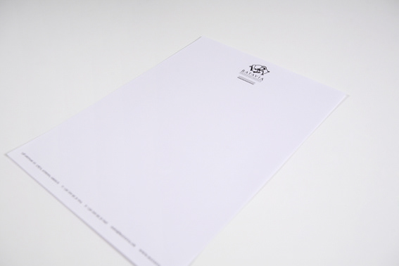
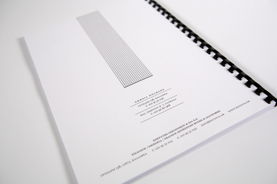
Finally, the same values of design were followed for the materiality of the company’s sign; the textured paper not only expresses the various textures of the products but also symbolizes the texture of the linen sacks that were used for packaging the goods during their transportation.
in this specific product sector.
So, Batavia was chosen as the most suitable main name and logo for the company, since it used to be one of the greatest spices and herbs trade centers of the world. At this direction, the working man became the logo sign as it consists of a figure-symbol of the way that ships were loaded with the commodities in the old ports.
Finally, the same values of design were followed for the materiality of the company’s sign; the textured paper not only expresses the various textures of the products but also symbolizes the texture of the linen sacks that were used for packaging the goods during their transportation.


Photography by Kelly Filiou